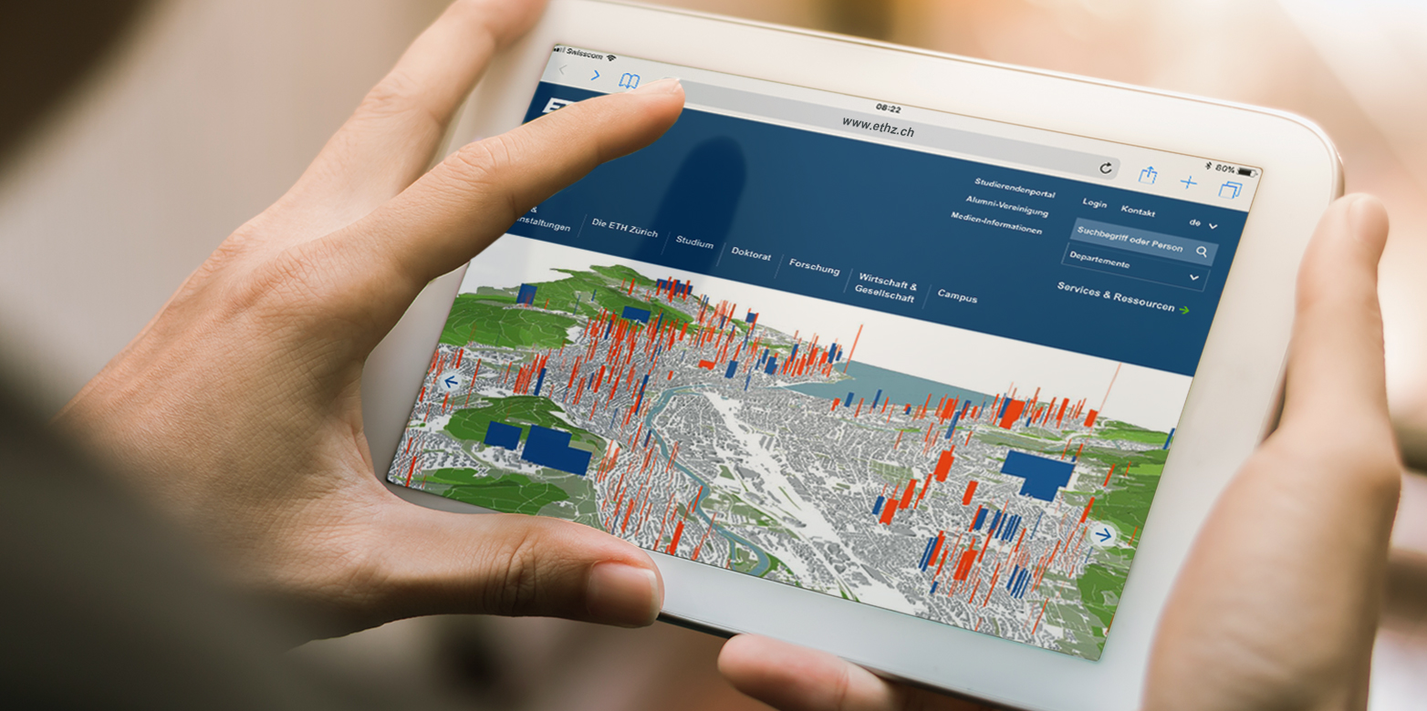
The ETH websites are now responsive
An increasing number of visitors is accessing ETH Zurich websites on mobile devices. In order to offer all visitors an optimal user experience, the switch to a responsive web design means that the content now adjusts flexibly to the respective screen size of the user.
Website users, irrespective of the device used, expect to be able to read and operate websites conveniently. For this reason, the project "Responsive Websites" was launched by Corporate Communications and IT services.
Under the project management of Christian Schär (IT Services) and the subproject management of Christine Khammash (Corporate Communications), all AEM websites of ETH Zurich have been converted to a responsive web design. This means that the presentation of a website's content allows for a better reading experience, depending on the device and that its functionality accommodates touchscreen devices. At the same time, the mobile website m.ethz.ch, which only presented a limited part of the ETH main page, has been taken offline.
Information about the new layout can be found on the overview pages within the is happy to help with questions regarding the ideal structure and presentation of website content.
