Accessible statistical charts / diagrams
Learn about the key requirements for accessible statistical graphics below with comparisons of more accessible and less accessible examples.
The requirements addressed in the examples mainly address the needs of people with a variety of different visual impairments, such as limited visual acuity, tunnel vision, or colour blindness.
Requirements for complex graphics and illustrations for the blind are addressed in the "Text Alternatives" accordion tab below
In a nutshell
When creating accessible statistical graphs and charts, pay particular attention to three aspects.
- Ensure that the contrasts between the representation of the data (points, lines, areas) and the respective background of the charts are clearly visible.
- WCAG: 1.4.3 Contrasts (external page https://www.w3.org/TR/WCAG21/#contrast-minimum).
- Avoid that the assignment between the displayed data and any legends is given by colour alone. Use different symbols, hatching, or patterns to represent the data. Furthermore, it is recommended to label the data directly within the graphics or their axes, also in addition to any legends.
- WCAG: 1.4.1 Use of Colours (external page https://www.w3.org/TR/WCAG21/#use-of-color)
- Always provide your statistical graphs with text alternatives that explicitly describe the most important information the graphs are conveying. Read more about good text alternatives in the accordion tab "Text Alternatives". Whenever possible, also provide your readers with the corresponding data basis for this purpose, e.g., as an accessible table.
- WCAG: 1.1.1 Non-Text Content (external page https://www.w3.org/TR/WCAG21/#non-text-content)
- For basics and background on the how-tos presented here, see e-Accessibility Basics and our Moodle course.
Examples
Below we contrast frequently seen, typical statistical charts with their more accessible versions for your convenience.
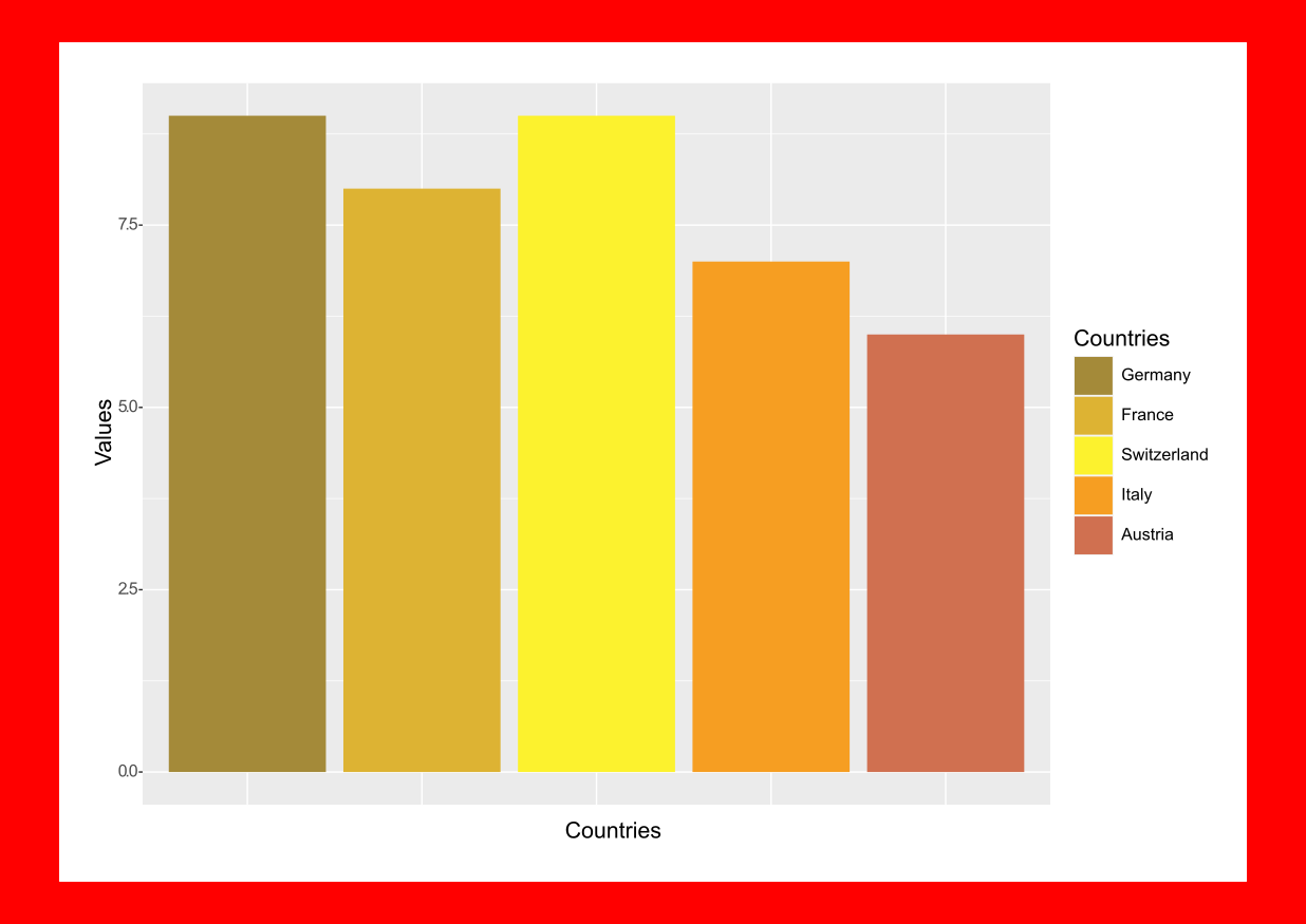
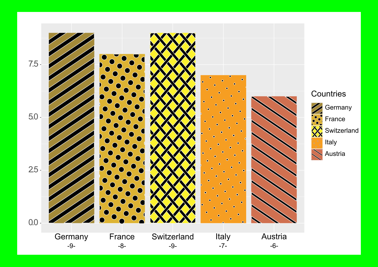
Bar charts
Bar charts are a typical example of graphs where legends are often used to label each data representation.
Poorly accessible example
This example violates the international guidelines for accessible electronic content WCAG in at least two ways. The colours of the bars lack contrast and are difficult to distinguish from each other. The connection between the individual bars and the corresponding legends is made solely by their colour scheme. It should also be noted that the labels are generally somewhat small.
More accessible examples
This, somewhat duller, but more accessible and print-friendly version meets the guidelines regarding contrasts as well as those regarding the use of colours. Not only can the bars here be easily distinguished and assigned to their respective legends. The bars are also all directly labelled and the labels are larger.
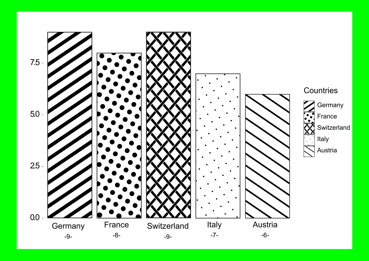
In addition, the individual bars are labelled directly on the x-axis and even provided with the respective values (y-axis).
The labelling of the individual bars and the connection of the bar patterns to the legend are redundant. Thus, the legend could also be omitted completely here.
The chart remains accessible even if the bars are coloured in addition to the hatchings:
The same techniques can be applied to other chart types. See Surface Area Charts (below).
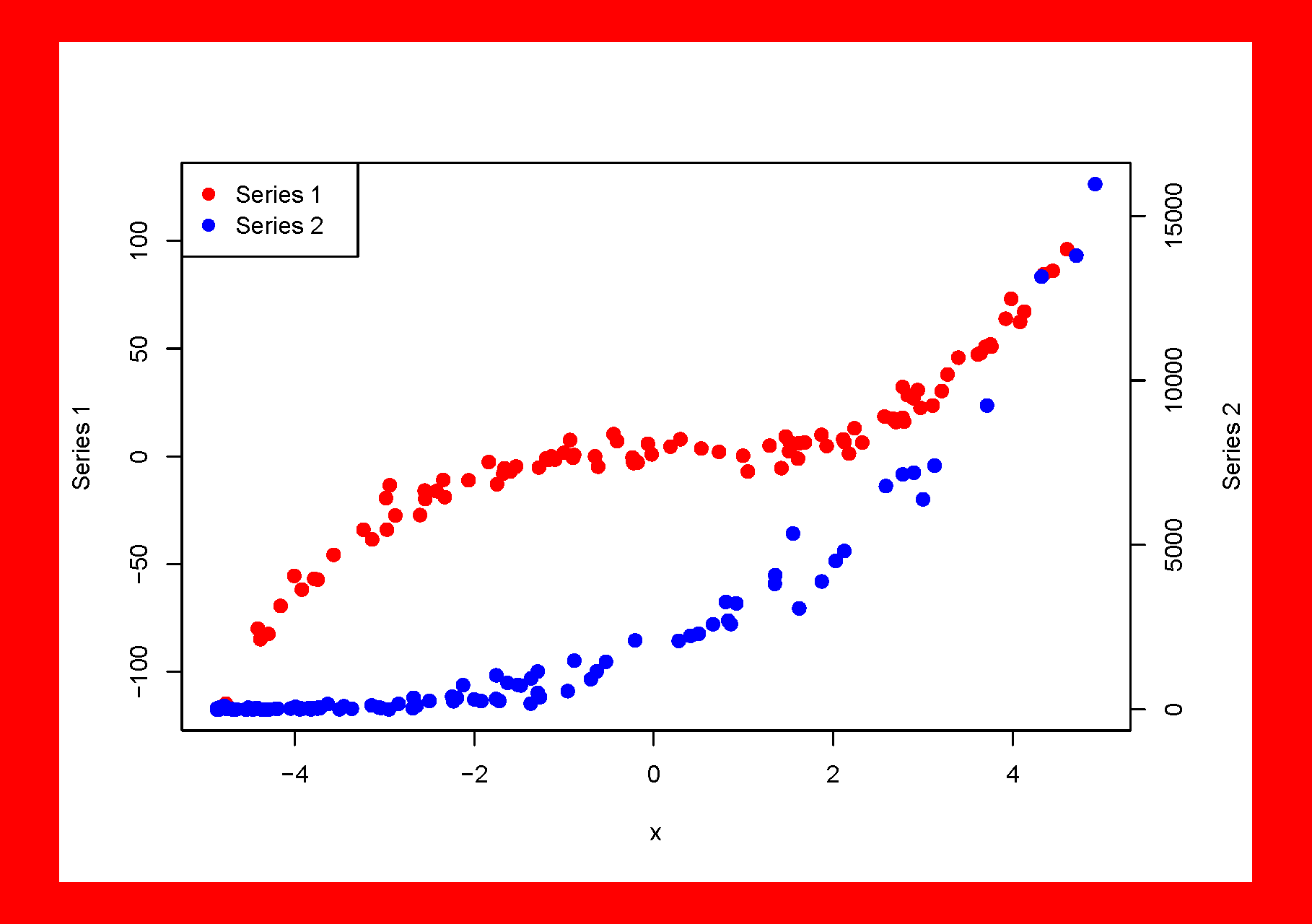
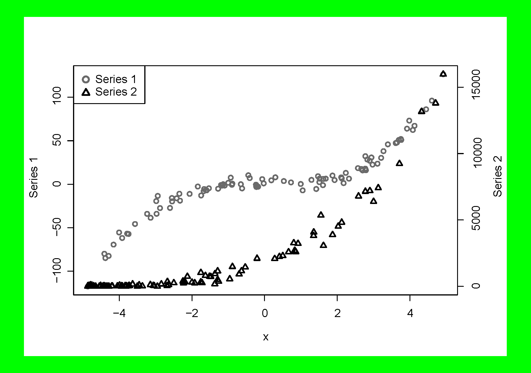
Scatter plots
Scatter plots often show different data series for direct comparison on one drawing area. The only difference between the data points of the different data series is their colour and they cannot be distinguished from each other in any other way.
Poorly accessible example
The red and blue points in the example below can be poorly distinguished by many people with poor colour and contrast perception.
More accessible example
Instead of using colours, the data points of the different data series are distinguished from each other using symbols. Of course, the data points may be coloured in addition to being displayed as different symbols, if the contrast to the background remains sufficient.
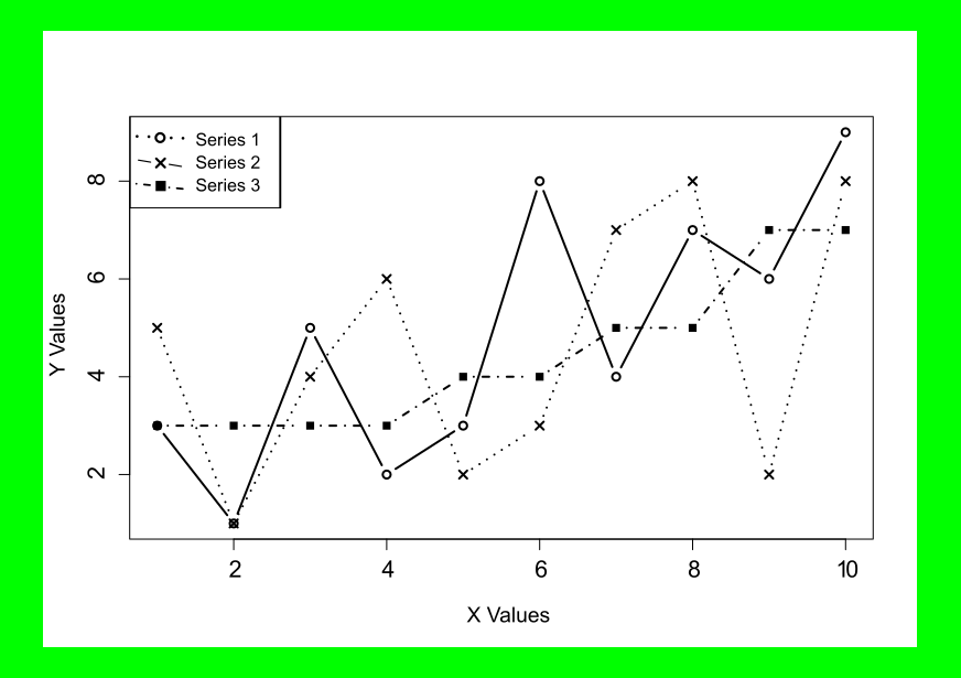
Line charts
Similar techniques as for scatter plots can also be applied to line charts. Instead of using colours to distinguish between different data series, different line types can be used for this purpose.
Poorly accessible example
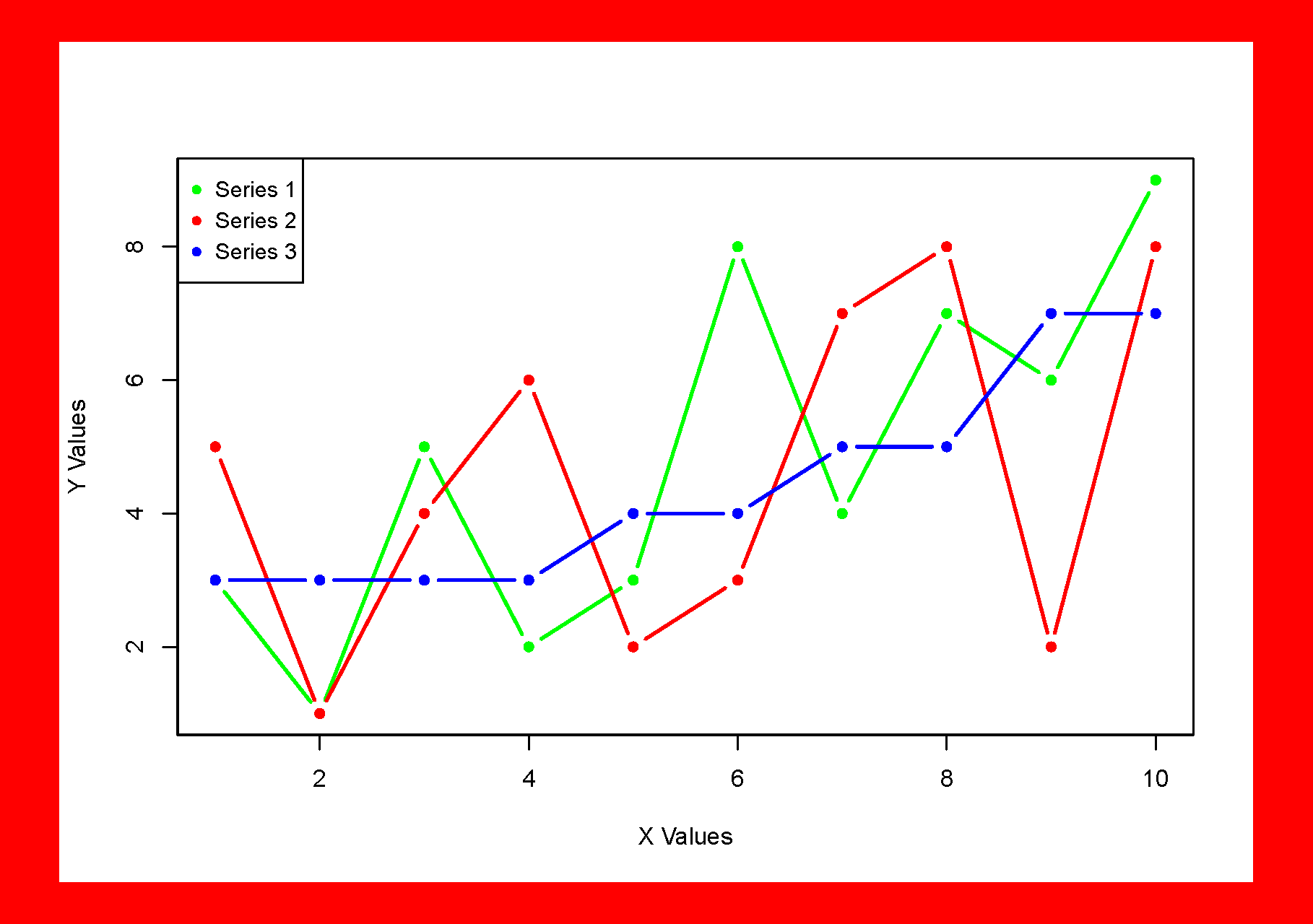
More accessible example
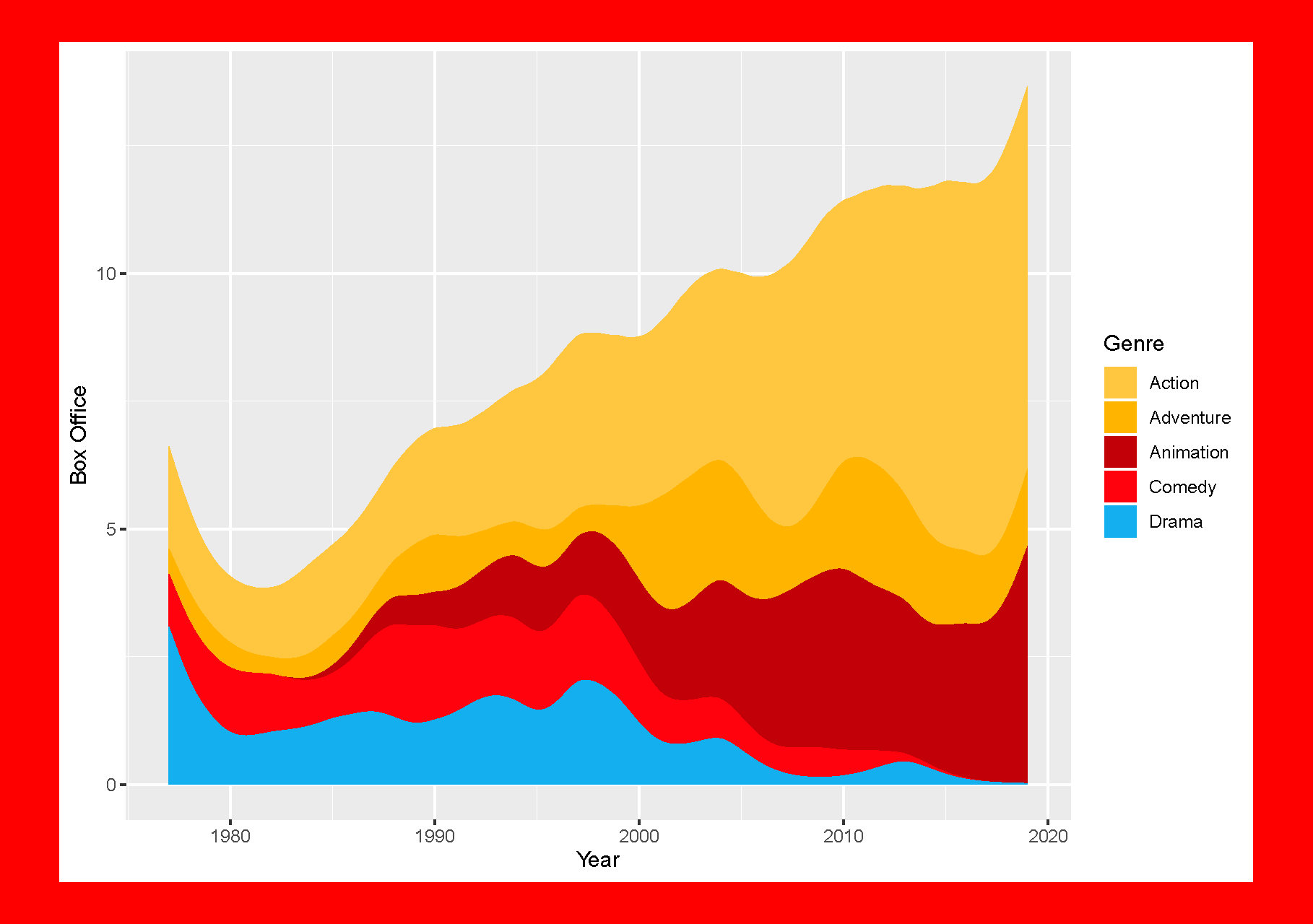
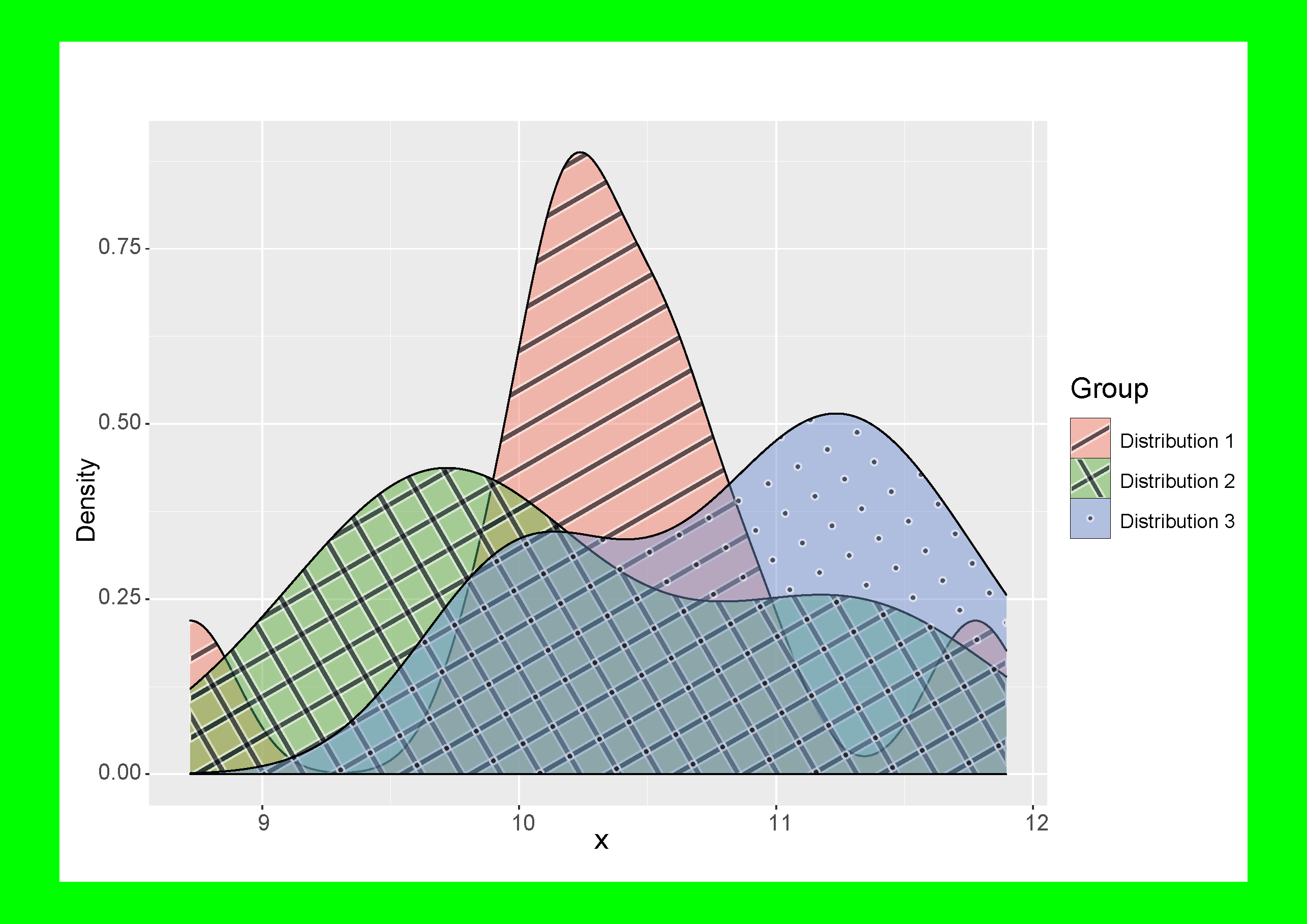
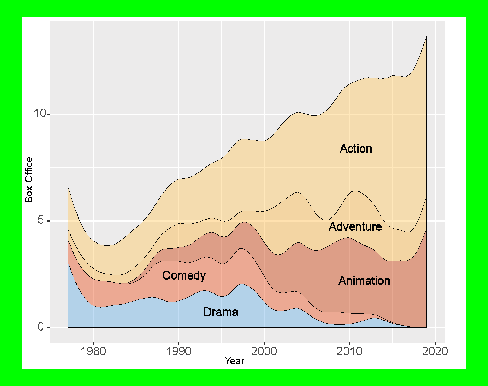
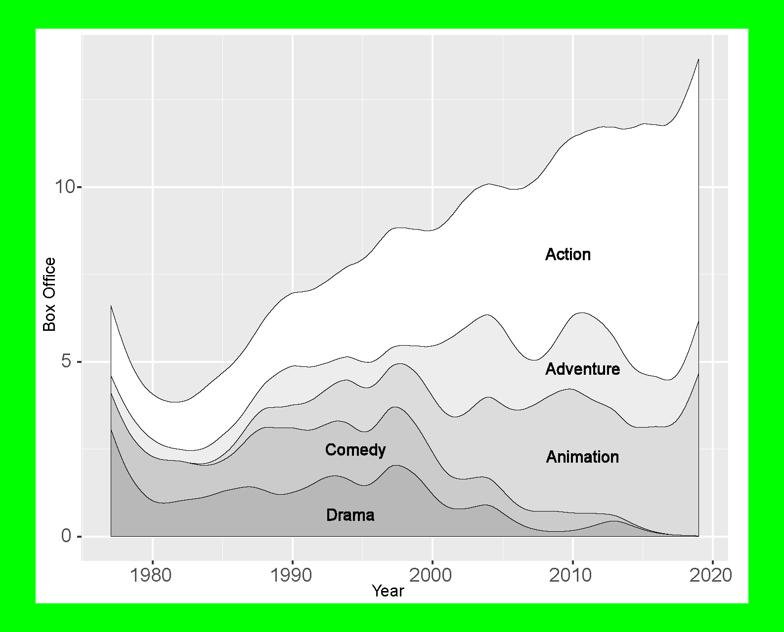
Surface Area Plots
For surface area plots there are similar problems as for bar charts. Mainly the connection between the surface representations on the drawing area and the corresponding legends by colour alone.
Poorly accessible example
More accessible examples
One technique for avoiding these typical barriers is to use patterns to label the various surfaces.
Other techniques involve placing the labels for the different surfaces directly in the drawing area.
In addition, care should be taken to ensure that the different areas are separated from each other by high-contrast lines so that they remain recognizable even to people with reduced visual acuity.
Of course, print-friendly versions in shades of grey are also permitted in the interest of accessibility.
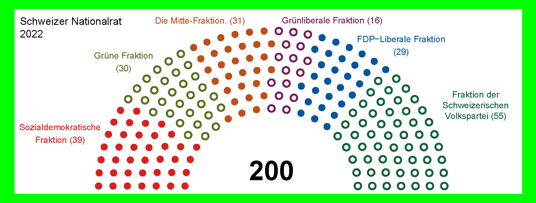
Schematic assignments
A special kind of graphical diagrams are schematic representations of seat assignments. Often in the context of reservation systems, where for example still free seats are marked green and sold ones red. Or price categories. Below as an example the composition of the Swiss National Council by political groups.
Poorly accessible example
The political groups are only linked to the respective group names by the colours of the individual seats (circle disks). The contrasts between neighbouring colours are sometimes too poor to distinguish them.
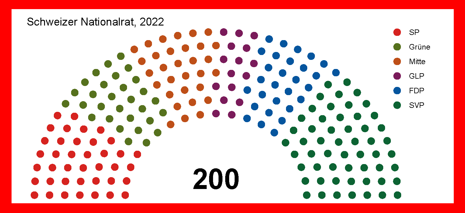
More accessible example
Neighbouring fractions are distinguished not only by colour, but also by the fact that some seats are shown as filled circular disks and others as circles with white filling. The assignment to the designation of the respective fractions is not done by a legend, but by labelling in the immediate vicinity of the seats depicted in each case.