Colours
This page describes how to use the colours of the ETH Competence Framework.
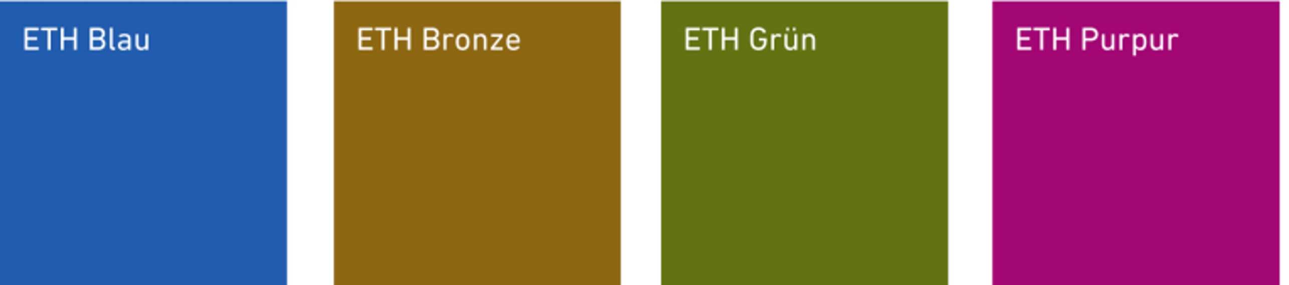
Colour palette and meaning
The ETH Competence Framework is designed based on ETH Zurich corporate design colours. Each colour represents a specific competency domain.
- ETH Blue is for the Subject-specific Competencies
- ETH Bronze is used for the Method-specific Competencies
- ETH Green is used for displaying the Social Competencies
- ETH Purple represents the Personal Competencies.
Colour shades
Different shades of the ETH Competence Framework colour palette can be used in graphics, illustrations, info boxes and layouts.
Coloured backgrounds with 40%, 20% and 10% opacity require the use of black text in order to remain readable. When using different shades of the design colours, please keep the needs of people with disabilities in mind. You can check the level of contrast for digital content with online tools such as external page ContrastChecker.
You can find the colour codes on the ETH corporate design web page.
DOs and DON'Ts about the colours
Contacts
LET
Curriculum and Faculty Development
Rector's Staff
Strategic Initiatives