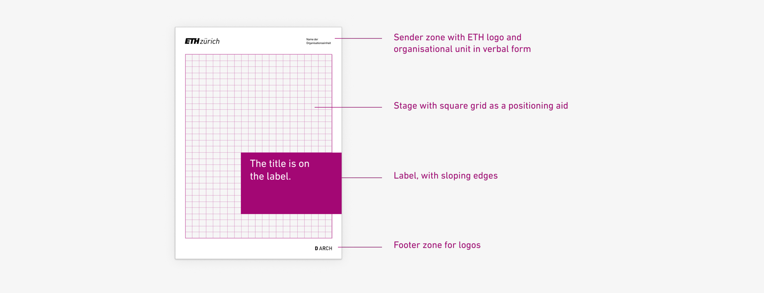
Layout
Our layout is optimised for good readability and visual consistency. There are many possible variations in the design.
Basic principles
- The ETH logo is placed at the top left of the sender zone. University partners can be placed next to it.
- At the top right is the organisational unit in verbal form (do not place any logos, icons etc. here!).
- The content area is characterised by a stage and a label
- Logos of organisational units and partners can be placed in the footer area.
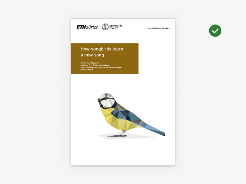
Examples of layouts in corporate design
The following layouts meet the requirements for branding, readability and accessibility.
-

The label can be freely positioned in the grid. It is coloured in the seven CD colours. -

The logo of the organisational unit is at the bottom left. The name of the organisational unit is at the top right in verbal form. -
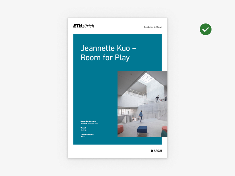
The image can be placed in the label and the text on the stage. -

The layout also works without an image. The CD colour can be combined with the brightened and dark colour shades. -
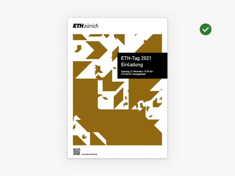
The key visual of ETH Zurich can be used for layouts without an image. The label may also be black. Place QR codes white on colour or black on white. -

The key visual can be a decorative element combined with photos. -

The picture does not have to fill the entire stage. White space is an important design element. -

Economic partners stand below the stage with a byline "Supported by" or "Partner institutions" -

It is possible to place round call-to-action elements. -
The stage can be white in the case of isolated images. Logos of university partners are placed to the right of the ETH logo. Other logos are not permitted in the sender area. -

Even if there are several photos on the stage, the layout grid is maintained.
Dont's
Diese Layouts verstossen gegen die Corporate Design-Richtlinien der ETH Zürich.
-
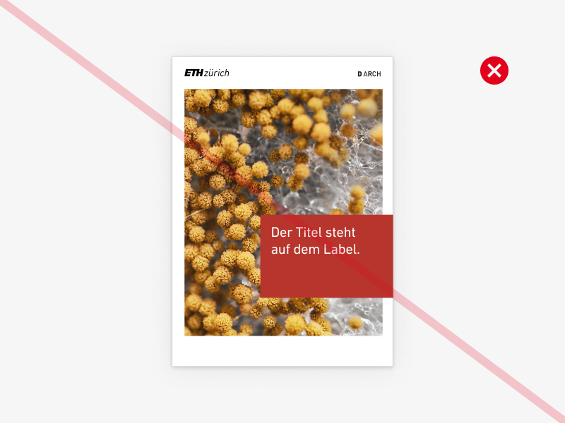
No logos (or icons, key visuals etc.) in the sender area! It is reserved for the ETH logo. The only exception is university partnerships. -
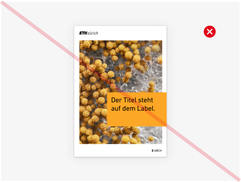
No extra colours. Only the seven CD colours and black may be used. The label should not be coloured in the brighter or darker shades of the CD colours. -
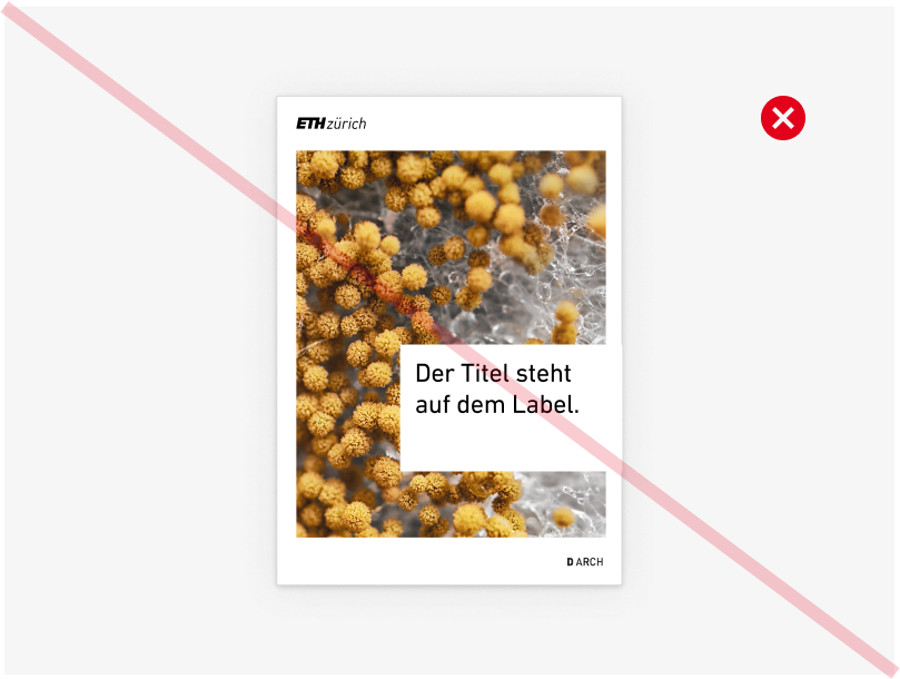
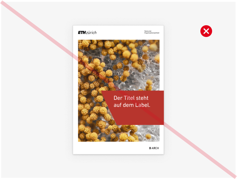
No white labels. -
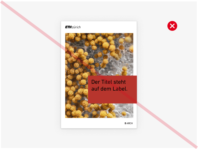
No black font on CD colour (accessibility) -

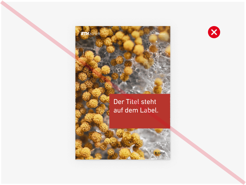
Stage must be placed in the layout area (not to the edge). -
No border-falling layouts with inverted logos (Only permitted for specific text-in-image applications, e.g. social media or small adverts). -
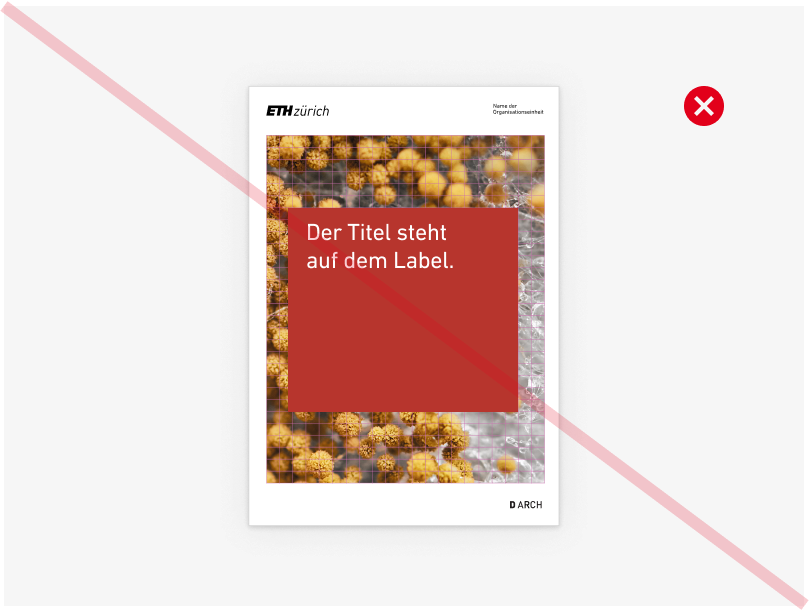
The shape of the label must not be changed. -
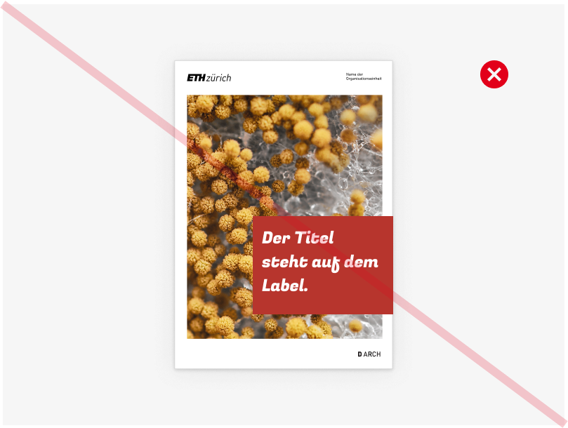
Do not use fonts other than Din Next (or alternatively Arial). -
The label must always have either a left or right margin.
Questions?
Please send us an e-mail. We will be happy to advise you if you have any questions about the design.
Kontakt
Branding-Team