Logo and sender
Sender hierarchy
The sender always comprises the master brand (ETH Zurich) and the actual organisational unit making the communication. No details are shown of the hierarchical structure between the two.


The organisational unit is always placed to the right of the master brand. It is always left justified and can run over one or two lines. The name of the organisational unit is aligned with the baseline of the logo and extends upwards. The width of the gap between the logo must be equal to the height of the ETH acronym.
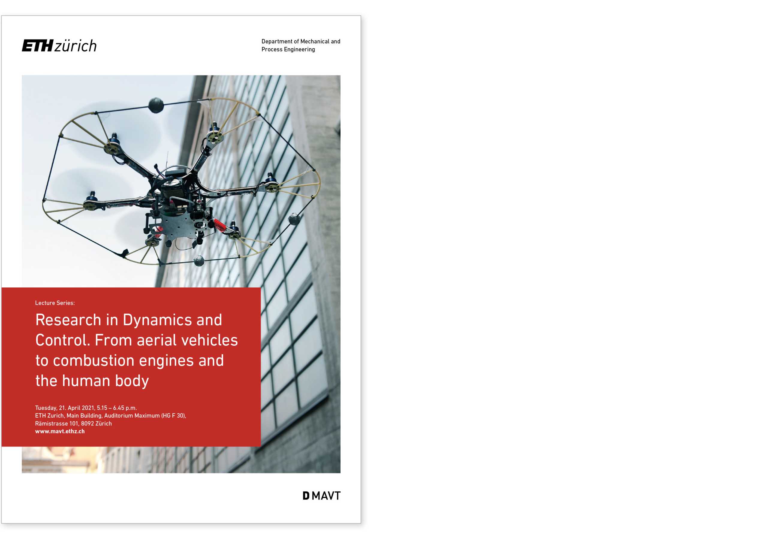
Printed material (e.g. brochure cover):
Maximum spacing between the ETH logo (aligned with the left edge of the type area) and full name of the organisational unit (Aligned with the right edge of the type area).

We align the organisational unit with the right edge of the type area. The placement is left justified and the name can extend less or more to the left depending on its length. In doing so, however, the minimum clearance with the ETH logo is always respected.
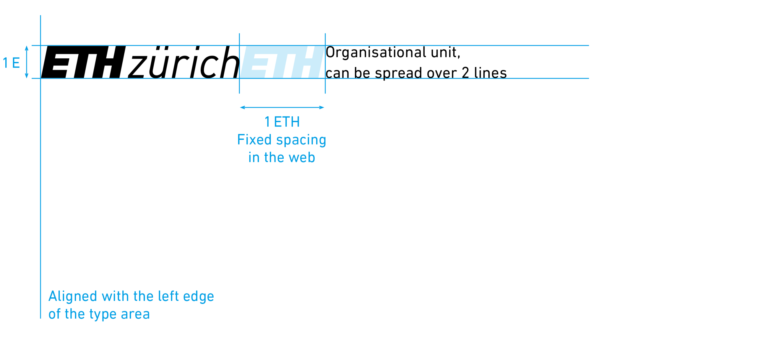
Webpage
There is a fixed space between the organisational unit and the ETH logo.
Logos from organisational units
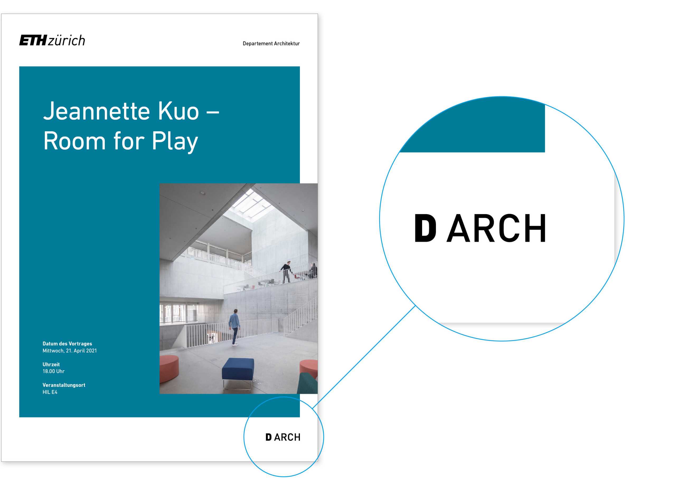
ETH Zurich organisational units can also display a logo in addition to their full name. Visually this logo has to be significantly smaller than the ETH logo. This relationship is defined as follows:
Relative size
The height of the department logo must be the same as the height of the letter “z” in the ETH logo. The same optical ratio applies to all other logos.

We place the logos of organisational units at the bottom right of printed materials. This area is clear to see in our templates.
Department logos
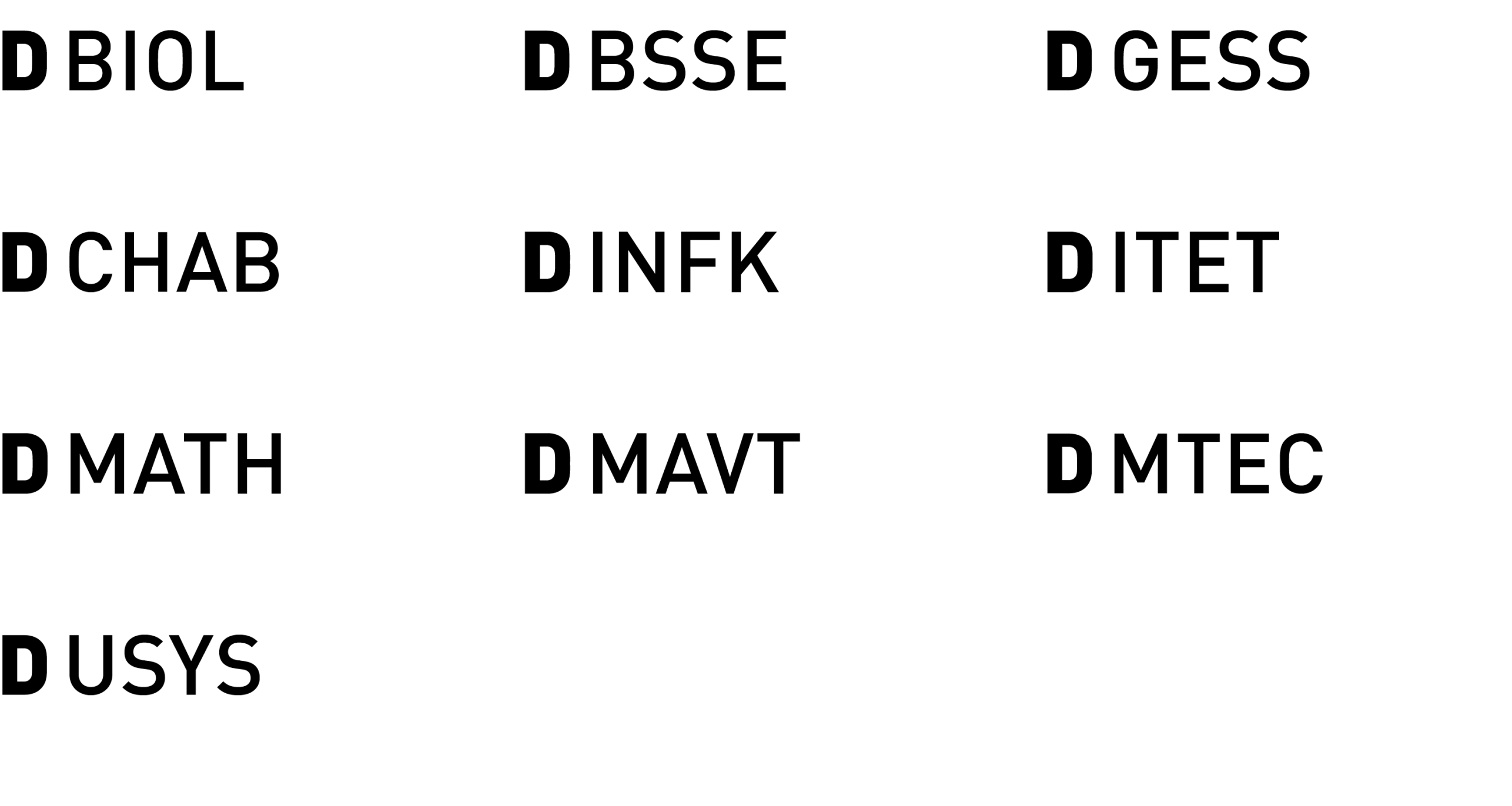
ETH departments have uniform logos.
Download departement logos
protected page lock Download Departements-Logos (ZIP, 6.5 MB)Cooperation partners / sponsors
We place the logos of cooperation partners and sponsors in the content area for webpages, and at the bottom format edge within the design area on title pages. They may of course also be placed on the back cover or inside pages.
The logos of cooperation partners or sponsors must be visually much smaller than the ETH logo. Where several have equal standing, the logos appear alongside each other in the same size.